Census ACS 1-Year Data Update

On September 26, the Census posted 1-year American Community Survey data, so for the increasing number of people (housing geeks) interested in gaining insights into the housing market, that means new facts and figures about rents and incomes in NYC. In an effort to move as fast as this city does, we’re working to bring you summary snapshots and analysis of these data releases as quickly as we can. Keep in mind that 1-Year survey data has the largest margin of error of the products that the Census releases (because it has a smaller sample), but it offers the most up-to-date insights. Read on for our take about the numbers and what they might mean for New Yorkers.
Rents
The estimated citywide gross median rent was $1,443 (+/- $9) in 2018. If you’ve looked for an apartment in the last five years, that monthly rent may strike you as a bit low. That’s because the Census estimates rents for all occupied units in the city, not just those that are available for rent. They include in their rents public housing, subsidized housing, and rent-regulated housing units that don’t turn over very often.
How has the gross rent changed over time? Between 2017 and 2018, the median gross rent increased by approximately $38 (+/-$20). The average annual increase over the last 19 years has been roughly $20, so the jump in 2018 nearly doubled typical growth. However, with a negligible increase between 2016 and 2017, the two-year growth closely tracks the recent historical average.
Incomes
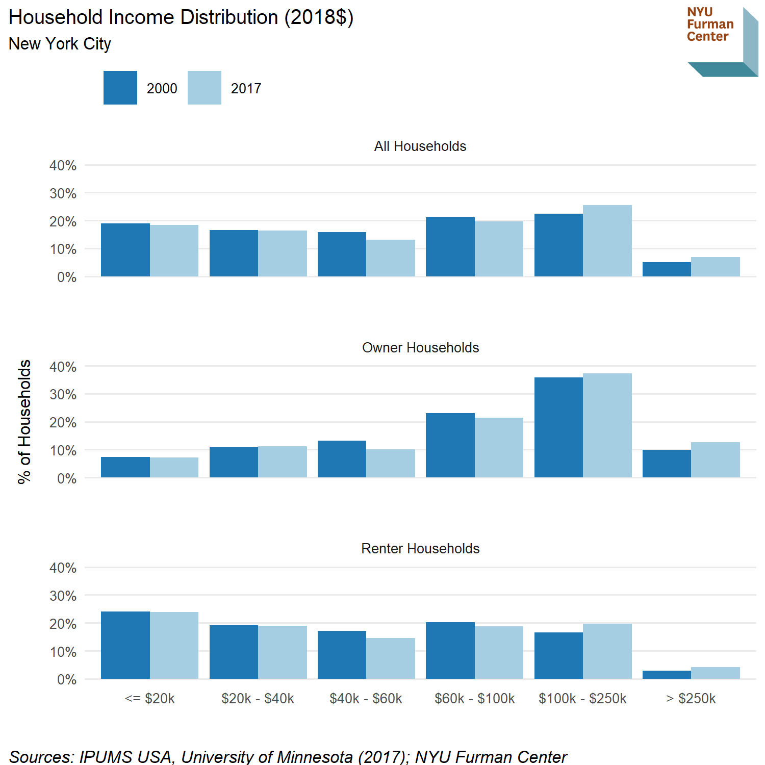
Of course, housing affordability is also a function of household income, and the new data show that median household income continues to rise. Median renter income grew to $50,349 (+/-$725) in 2018, up $2,334 (+/-$1,443) from 2017. Increasing renter incomes could reflect wage growth among residents, but it could also reflect a change in the composition of the renter population, with more affluent households renting instead of purchasing homes. For example, when we compare the distribution of household incomes between 2000 and 2017, we see the share of renter households with incomes between $40k and $100k has fallen, while the share has increased for households with incomes over $100k. Contrast this with the share of households with incomes below $40k, which has remained about the same. Note that this data is from 2017 (converted to 2018 dollars), as it uses the ACS microdata that will not be released by the Census Bureau until November. Even with new data, it is impossible to precisely evaluate the relative effects of household income growth versus a changing population without drilling down and following individual households over time.

Trends
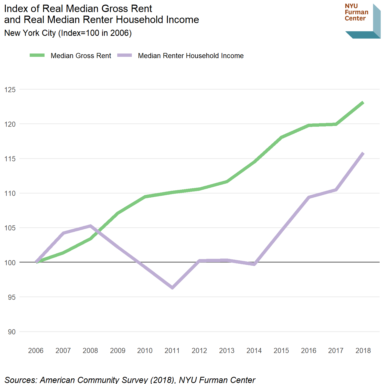
While both median rent and median income grew between 2017 and 2018, income grew by a larger percentage. In the figure below, we’ve indexed both rent and income to 2006, which provides a common starting point. Prior to the recession, renter income grew at a higher rate than median rents. Income then fell between 2008 and 2011, as rents in New York City continued to climb, mostly unabated. By 2014, the gap between rents and incomes was at its peak, but since then, incomes have been growing slightly faster than rents.

Neighborhood Breakdown
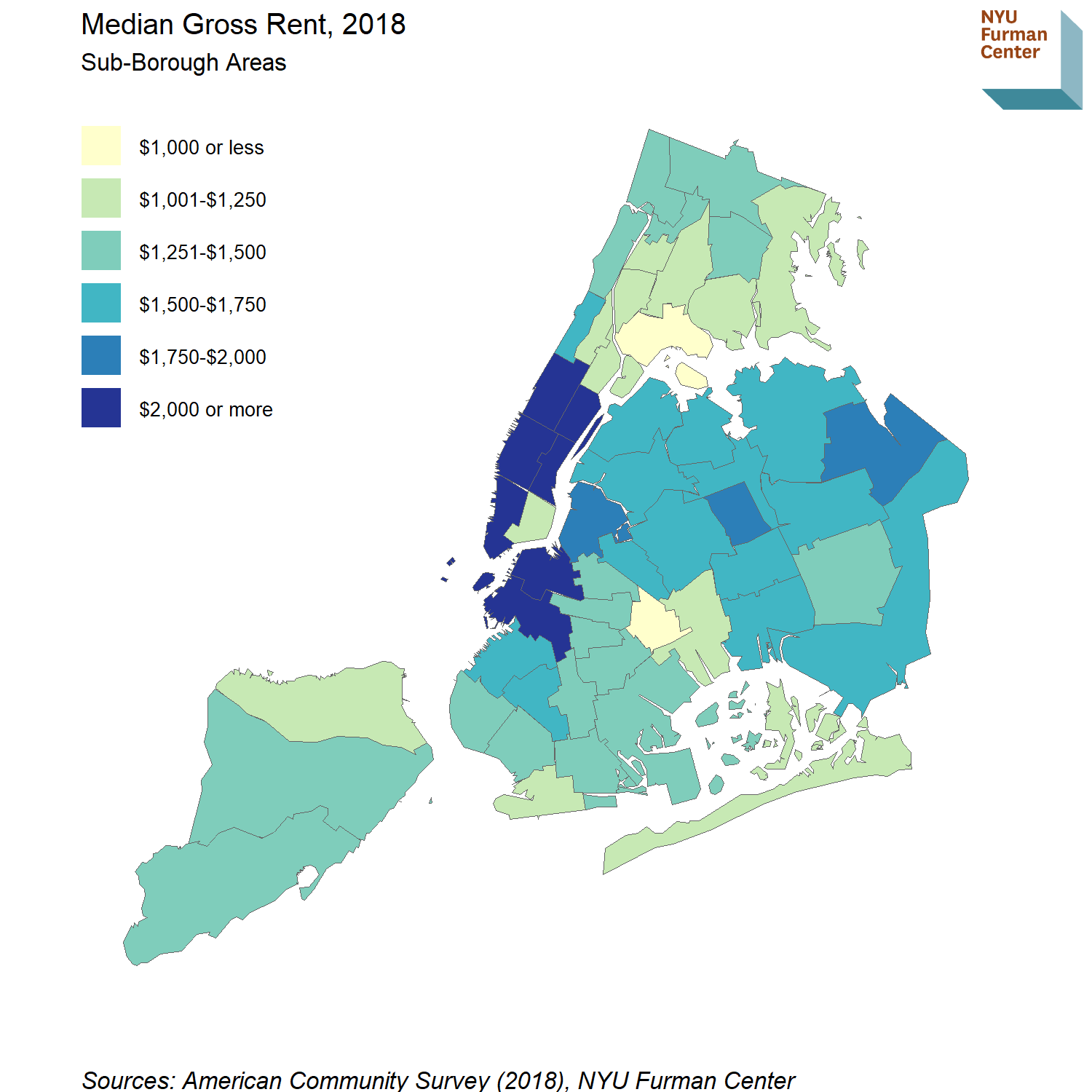
In the map below, we can see how these trends play out across the city. Two neighborhoods (as captured by sub-borough areas, which closely approximate community districts) have median rents below $1,000: Brownsville/Ocean Hill in Brooklyn and Hunts Point in the Bronx. The Lower East Side/Chinatown stands out in Manhattan as a small pocket of affordability with a median rent of $1,140. That’s most likely due to the high concentration of public housing and other forms of subsidized housing found there, as well as older, rent-regulated apartment buildings in parts of the neighborhood.
Unsurprisingly, core Manhattan and downtown Brooklyn have the highest median rents citywide, with most neighborhoods showing a median of over $2,000.Two neighborhoods in Queens stand out for their relatively high rents compared to the rest of the borough: Rego Park/Forest Hills and Little Neck/Bayside. The latter had the highest median rent in Queens at $1,844, was second only to Staten Island’s South Shore in homeownership rate, had one of the highest shares of 3BR rental units in the borough, and had a low supply of overall rental housing with less than 10,000 units.

Housing Stock and Borough Breakdown
The Census data also provide a breakdown of estimated rents by apartment size. Perhaps surprisingly, the median rent across the city for a 2BR is only $147 higher than for a studio. This small gap is partly explained by variation in the neighborhood location of units of different sizes. For example, studios are disproportionately located in high-rent neighborhoods in Manhattan.
| Median Gross Rent by Bedrooms, 2018 | ||||||
|---|---|---|---|---|---|---|
| Sources: American Community Survey, NYU Furman Center |
Indeed, in Manhattan, the median rents for 2BR and 3BR apartments were lower than the rents for studios and 1BR units. Again we can assume that public and other subsidized housing units are a major reason for these lower rents, as well as the pre-war stock of rent-regulated larger units. Newer, market-rate units in Manhattan tend to be smaller, while larger units are disproportionately located in public housing and other subsidized housing. Given the high cost per square foot of Manhattan rentals, the idea of a 3BR rental for $1,527 (+/-$112) is worth noting. That’s less than a renter would pay for the median 3BR in Brooklyn, Queens, or Staten Island.
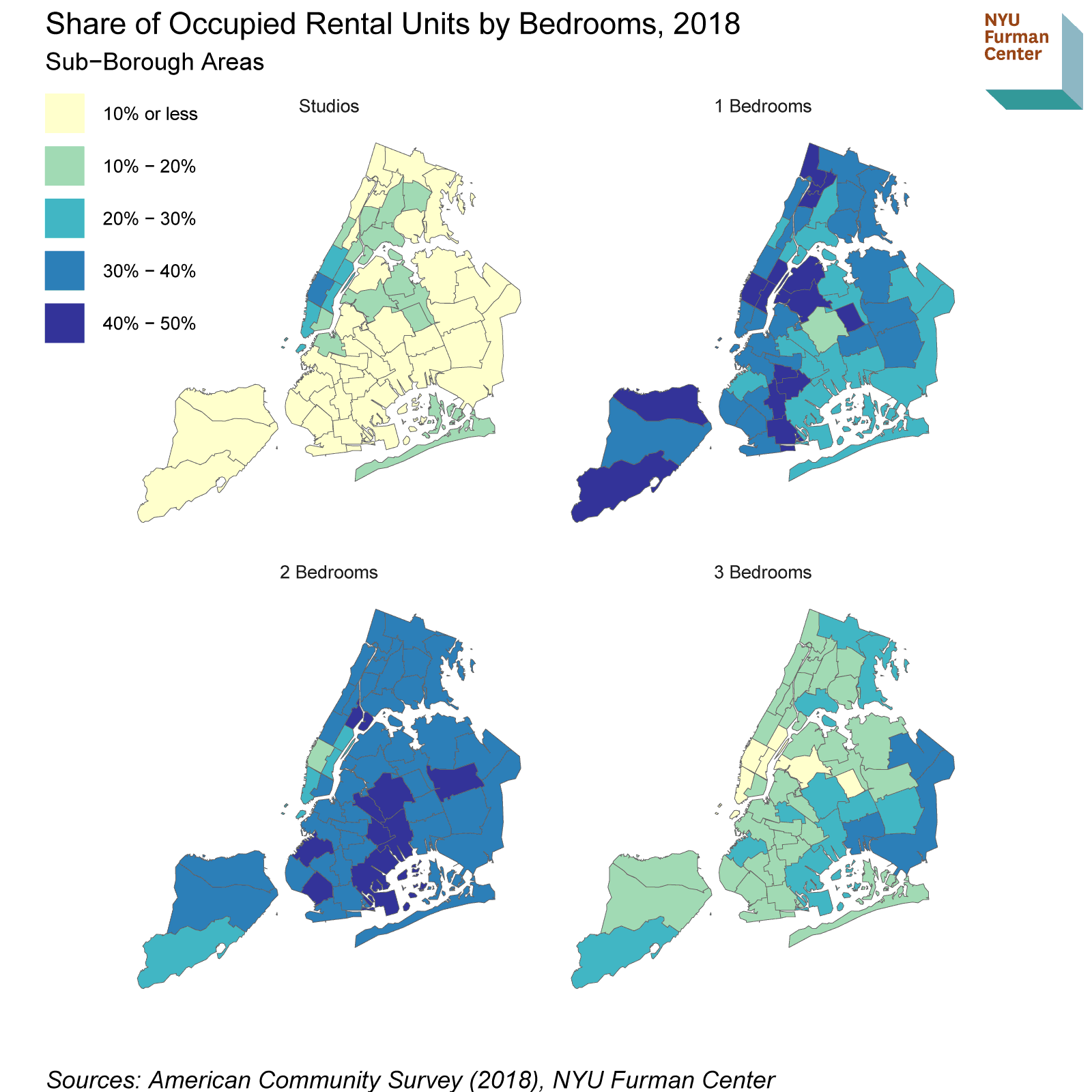
Looking more broadly at where units of different sizes are concentrated, we see the highest share of 2BR apartments in Central and Southern Brooklyn, while 3BR units are disproportionately represented in Southeast Queens.

Accurate Census data provide a critical window into who we are and how we live, and this release provides insight into our rental housing market. Renter income continues to make up ground in comparison to median rent, but still has not reached pre-recession levels. Studio units can provide lower cost housing for single adults or small families, yet they are mostly located in the city’s least affordable places.(The Furman Center released a Policy Brief last year on 21st Century SROs that could begin to address the supply issue for smaller units, making them available at a wider range of price points to meet housing demand for single adults.) The data also highlight the large variation in housing types and rents across the city, and even within individual boroughs.
Stay tuned to this space for more as we get new data sets from Census, the Department of Housing Preservation and Development, and the New York City Department of Finance.


