State of the City 2021
New housing often comes with controversy, and New York City is no exception. Much rides on these new units; they may affect long-run affordability, shift infrastructure use, enhance or undermine sustainability and resilience, and shape neighborhood amenities. They may also make New York City more competitive in attracting and retaining diverse talent, and make the city more welcoming to those from all over the world who want to share in the immense opportunities available here. New housing–particularly new affordable housing–can be a gateway to well-resourced neighborhoods for low-income families, can help to accommodate migrants seeking economic, cultural, and educational opportunities, and work to counter centuries of racial and economic segregation. At the same time, development has long generated concern about gentrification and displacement pressures. New Yorkers disagree about how much housing should be built, where it should be located, and how many income-restricted apartments, targeted to what household incomes, can feasibly be provided. In the end, policymakers have some tools to encourage or discourage new development, but market forces also play a large role in determining what type of housing is built and where.
In this report, we examine the geography of new market-rate and income-restricted multifamily housing (properties with four or more units, both rental and ownership) that were completed over the last decade, a time when the city’s population grew by more than 629,000. 1 We limit our analysis to properties with four or more units, in part because tax exemptions, subsidies, and regulations for multifamily development often differ from those for smaller buildings; we estimate that our analysis covers more than 90 percent of newly-constructed units during this time period.
Reports of new housing construction often highlight aggregate numbers. To help understand the contributions from various segments of the housing market, we separately estimate the number of completed market-rate and income-restricted units. For income-restricted units, we further parse out counts based on the level of income targeting (low-income versus moderate-income households) and the form of subsidy the buildings received. Given the current policy debate, we separately consider income-restricted units built only with the 421-a tax exemption and no other subsidy.
We also compare the average characteristics of neighborhoods where new market rate units were built to those in which new income-restricted units targeted to low- and moderate-income households were located. In addition, we examine the role of land use tools–zoning districts, historic districts, and upzoned areas–in shaping the geography of newly built units. Finally, we consider the extent to which new developments were built in areas with an elevated risk of flooding from storm surges, an issue that has gained new potency in the last decade as the city begins to grapple with the increasingly dire risks of climate change.
In this brief, we ask and answer the following questions about the geography of newly-completed multifamily development in New York City between 2010 and 2020:
Our focus is on multifamily units completed, as evidenced by the issuance of a Final Certificate of Occupancy, between the beginning of 2010 and the end of 2020. We track newly-built multifamily housing using publicly-available, property-level data from the New York City Department of Buildings (DOB) on four or more unit properties receiving their Final Certificate of Occupancy. We match these completed properties to data from the New York City Department of City Planning (DCP) and the New York City Department of Finance (DOF) to identify such property characteristics as location, size, and tax exemption status.
Using various data sources (see appendix), we estimate the number of income-restricted units in multifamily buildings completed between 2010 and 2020. We estimate four mutually exclusive categories: market rate units, income-restricted units targeted to moderate- and middle-income households (earning between 81% and 165% of AMI), income-restricted units targeted to low-income households (earning up to 80% of AMI), and units with unknown income targeting. 2 We categorize units in these categories, rather than at the building or property level, because many properties are mixed-income and include different types of units.
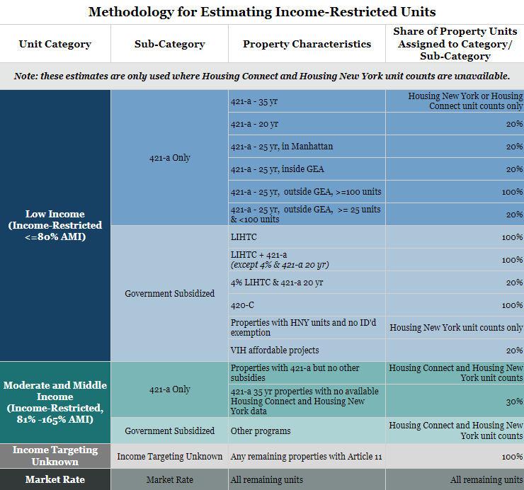
At times, we also break our non-market rate categories into two mutually-exclusive groups for additional detail, categorizing them as “421-a Only” or “Government Subsidized.” The first category consists of units in properties that benefit from the 421-a tax exemption program, but do not benefit from other forms of government subsidies (e.g., Low-Income Housing Tax Credits [LIHTC], city capital loans, etc.). While 421-a is technically a government subsidy itself, we isolate it as a separate category to take a closer look at properties that solely benefitted from the exemption. The second category includes units that received other sources of government subsidy, such as LIHTC and City capital loans. In some cases, these buildings also used the 421-a tax exemption. It is worth noting that about 15 percent of Government Subsidized properties, and more than 35 percent of Government Subsidized units used the 421-a tax exemption in combination with other subsidies. Additionally, both categories may also include properties that were built with additional zoning capacity made available by the Voluntary Inclusionary Housing (VIH) or Mandatory Inclusionary Housing (MIH) programs; we are limited in our ability to identify which properties use those programs onsite or offsite. However, we should capture the majority of income-restricted units under those programs via our use of Housing New York data dating back to 2014, including all MIH units (the program was adopted in 2016).
For more information about our estimation approach, please refer to the detailed technical appendix.
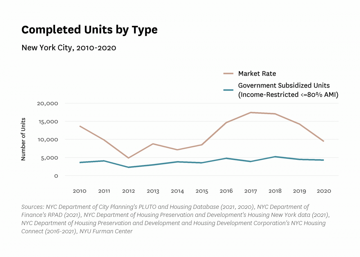
Between 2010 and 2020, New York City saw more than 185,000 new multifamily units. The pace of construction varied greatly across years, with the number of new units declining to close to 7,500 units completed in 2012 (following the wake of the 2008 economic crisis), then rising to a peak of close to 25,300 units in 2018, before declining again through 2020 (Figure 1). The majority of newly-completed units were market rate (Figure 2). The number of units in Government Subsidized properties that were targeted to low-income households varied year to year, but generally rose steadily between 2012 and 2020, with the lowest annual level of completed units in 2012 and the highest level in 2018. It is important to note that the figures below are limited to properties that received a Final Certificate of Occupancy during this time period; properties that were permitted or received a Temporary Certificate of Occupancy are not counted, but may have completed in recent years (new buildings commonly receive multiple Temporary Certificates of Occupancy).
Figure 1:
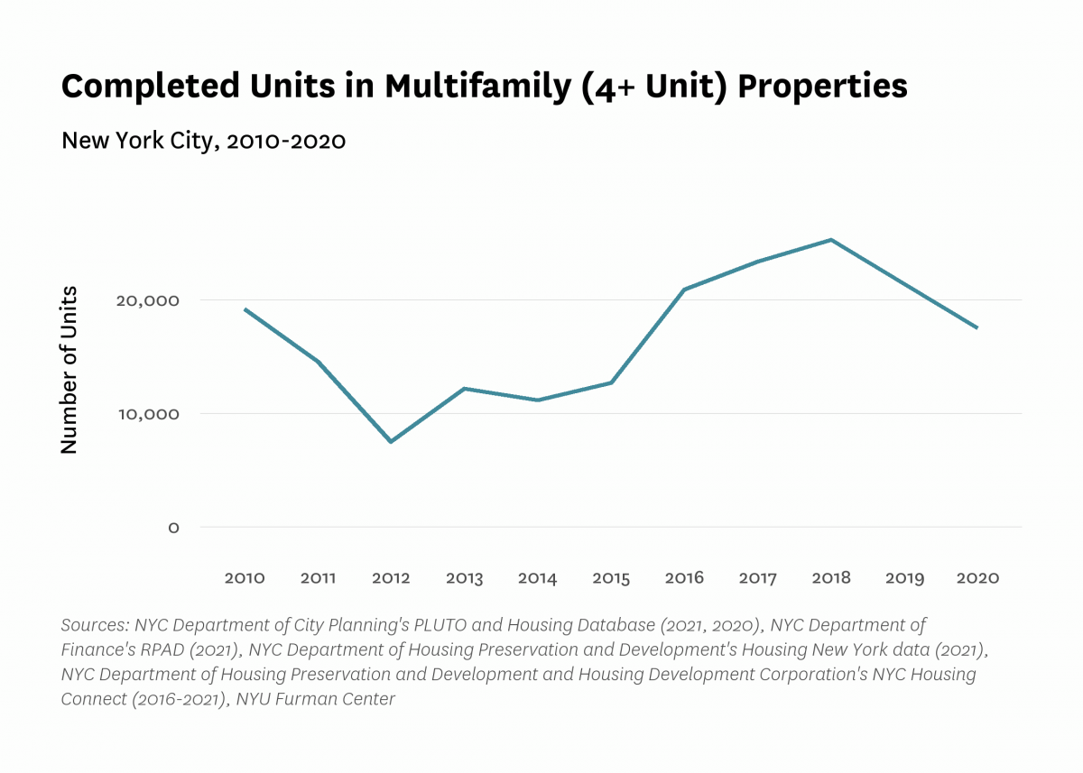
Figure 2:
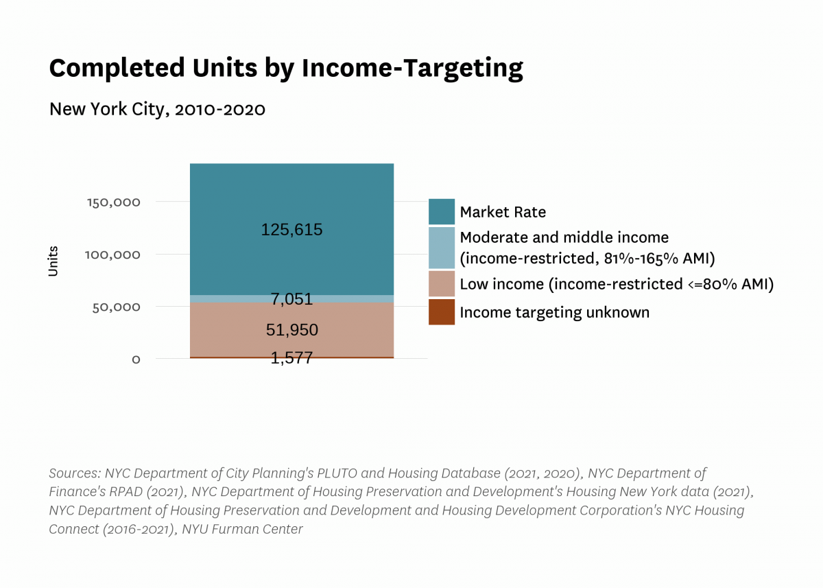
Our estimates show that market-rate units accounted for about two-thirds of new construction between 2010 and 2020 (Figure 3). 3 Income-restricted units targeted to low-income families made up 28 percent of all newly-completed units. In addition, about four percent of newly constructed units were income-restricted and targeted to moderate-income or middle-income households (earning 81%-165% of AMI), a trend largely driven by the Affordable New York Program (the current version of the 421-a tax exemption). Finally, less than one percent of units were in properties with unknown levels of income targeting.
Figure 3:
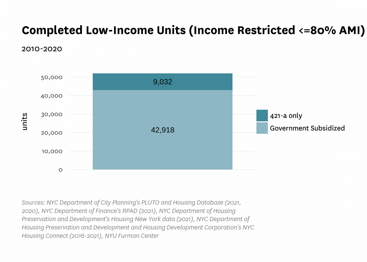
Between 2010 and 2020, units in Government Subsidized properties (over a third of which were in properties that also benefited from the 421-a exemption) were responsible for the great majority (82%) of new income-restricted units targeted to households earning 80 percent of AMI or less (Figure 4). Units in properties receiving the 421-a tax exemption only (and no other government subsidies) made up the rest of the units targeted to low-income households captured in our estimate (18%).
Figure 4:
Of the close to 52,000 estimated units targeted to low-income households completed between 2010 and 2020, more than 40 percent (more than 21,900 units) were built in the Bronx (Figure 5). Brooklyn and Manhattan followed the Bronx, with close to 15,100 and 9,500 estimated new units restricted to low-income households, respectively. Queens and Staten Island, both boroughs where lower-density zoning is more prevalent, trailed the rest of the city (with close to 4,400 and 1,000 units targeted to low-income households, respectively). The Bronx saw the largest share of new multifamily units targeted to low-income households (70 percent). Most of those were in Government Subsidized properties (94%), while the low-income units in Manhattan were far more likely to be located in properties with 421-a but without government subsidies (35%).
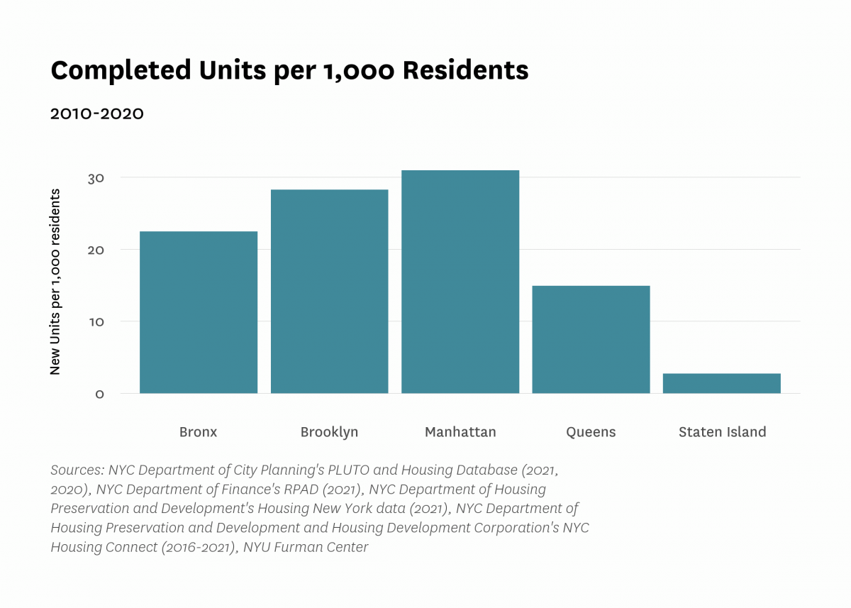
Of all the boroughs, Manhattan saw the largest boost in new housing relative to its 2010 population, with 31.0 new units per 1,000 residents, while Staten Island saw the smallest (2.7 new units per 1,000 residents) (Figure 6). Overall, the number of new units built in the city over the decade amounted to 22.7 new units per 1,000 residents present in 2010.
Figure 5:
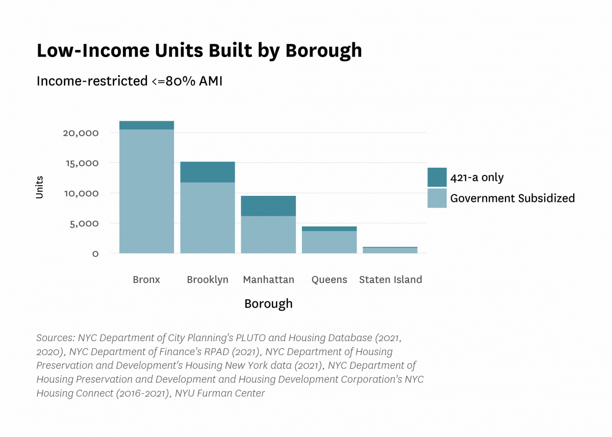
Figure 6:
Over the last decade, new units built in multifamily properties were mostly located in areas near to midtown Manhattan, likely reflecting high market demand as well as available zoning capacity. New units were primarily located in Chelsea/Clinton/Midtown in Manhattan, Williamsburg/Greenpoint in Brooklyn, Brooklyn Heights/Fort Greene in Brooklyn, Sunnyside/Woodside in Queens, and Morrisannia/Belmont in the Bronx (Figure 7, Table 1). Market-rate units were also concentrated in those neighborhoods, with the exception that the Morrisania/Belmont neighborhood in the Bronx saw relatively low levels of market-rate development. Units targeted to low-income households built with 421-a only (and no other government subsidies) generally followed the same pattern as market-rate units because they were often located together in the same properties. The geography of those units did not always match market rate ones, likely due to the fact that earlier versions of the 421-a tax exemption allowed some income-restricted units to be built off-site.
Less affluent areas of the city saw the greatest number of income-restricted units targeted to low-income households developed over the prior decade, mainly driven by units in Government Subsidized properties. Broadly, Government Subsidized units targeted to low-income households were concentrated in less affluent neighborhoods than income-restricted units in 421-a buildings that received no other subsidies. Neighborhoods with high numbers of Government Subsidized units targeted to low-income households included the South Bronx, particularly Morrisania/Belmont and Mott Haven/Hunts Point, as well as Brownsville/Ocean Hill in Brooklyn. Finally, new units targeted to moderate- and middle-income households were concentrated in Jamaica, Queens, as well as Greenpoint/Williamsburg and Bushwick in Brooklyn.
Figure 7:
Table 1:
| Top Ten Sub-Borough Areas: Total Units | |||||
|---|---|---|---|---|---|
| Sub-Borough Area | Market Rate Units | Moderate- and Middle-Income Units | Low-Income Units | Income Targeting Unknown | Total New Units |
| Chelsea/Clinton/Midtown | 15,074 (80%) | 414 (2%) | 3,167 (17%) | 239 (1%) | 18,894 (100%) |
| Williamsburg/Greenpoint | 13,746 (82%) | 593 (4%) | 2,485 (15%) | 0 (0%) | 16,824 (100%) |
| Brooklyn Heights/Fort Greene | 11,725 (77%) | 375 (2%) | 3,064 (20%) | 0 (0%) | 15,164 (100%) |
| Sunnyside/Woodside | 12,244 (89%) | 172 (1%) | 1,372 (10%) | 0 (0%) | 13,788 (100%) |
| Morrisania/Belmont | 1,577 (16%) | 165 (2%) | 7,865 (81%) | 263 (3%) | 9,757 (100%) |
| Astoria | 6,467 (92%) | 131 (2%) | 438 (6%) | 0 (0%) | 7,036 (100%) |
| Mott Haven/Hunts Point | 1,391 (20%) | 284 (4%) | 5,382 (78%) | 0 (0%) | 6,894 (100%) |
| Bushwick | 4,337 (77%) | 517 (9%) | 805 (14%) | 8 (0%) | 5,667 (100%) |
| Upper West Side | 4,434 (85%) | 0 (0%) | 795 (15%) | 0 (0%) | 5,229 (100%) |
| Greenwich Village/Financial District | 4,535 (90%) | 18 (0%) | 459 (9%) | 0 (0%) | 5,012 (100%) |
| Sources: NYC Department of City Planning's PLUTO and Housing Database (2021, 2020), NYC Department of Finance's RPAD (2021), NYC Department of Housing Preservation and Development's Housing New York data (2021), NYC Department of Housing Preservation and Development and Housing Development Corporation's NYC Housing Connect (2016-2021), NYU Furman Center | |||||
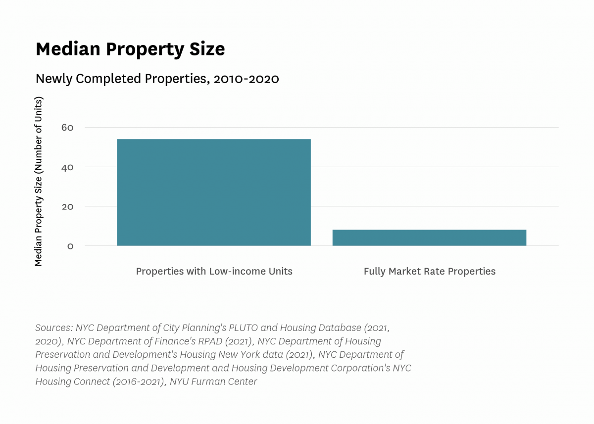
Properties that included units targeted to low-income households were typically much larger than fully market-rate properties (Figure 8). While the median size of newly-completed multifamily properties that included units restricted to households earning up to 80 percent of AMI was 54 units, the median size of a new, completely market-rate multifamily property was just 8 units.
Figure 8:
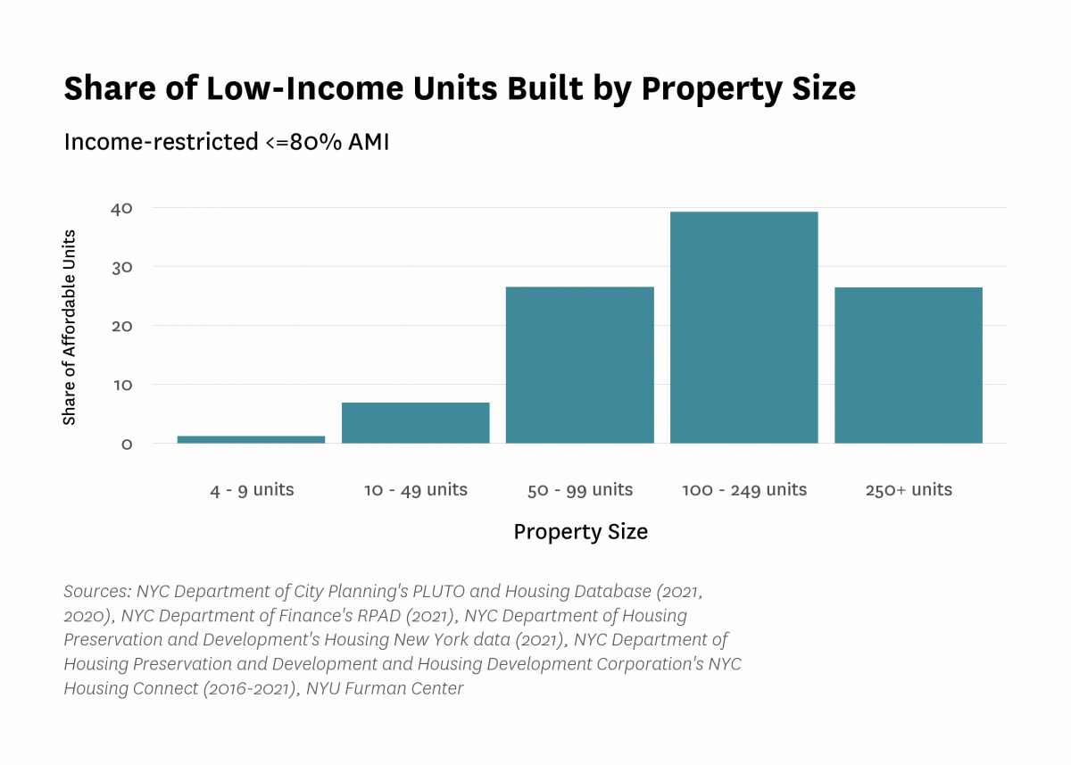
Large properties drove the development of new units targeted to low-income households over the past decade. Close to two-thirds of the units targeted to low-income households were built in large properties (100 units or more), with 39 percent of units in properties with between 100 and 249 units (Figure 9). In contrast, properties with fewer than 50 units accounted for only eight percent of units targeted to low-income households.
Figure 9:
Over the course of the decade, new multifamily housing was constructed in neighborhoods with higher white population shares, higher share of renter households, higher unit sales prices, higher rents, and higher incomes than the average neighborhood (defined as Sub-Borough Area (SBA) for the analysis) (Table 3). But there was considerable variation across housing types in terms of neighborhood attributes. Market-rate units were generally built in more advantaged neighborhoods (with higher than average white population shares, college graduation rates, building sales price, rents, and household incomes) than new units overall. By contrast, income-restricted units targeted to low-income households were built in SBAs that had higher poverty rates, lower family incomes and median rents, and higher Black and Hispanic population shares on average compared to new units overall.
Among new income-restricted units targeted to low-income households, the average neighborhood of units receiving 421-a tax benefits but no other subsidies was more economically advantaged, with lower poverty rates, higher incomes, and higher sales prices and rents than the average neighborhood of new units built with other government subsidies. Indeed, the average neighborhood of a unit targeted to low-income households and built with the 421-a tax exemption only looks more similar to that of a market rate unit, likely due to the fact that the 421-a program typically requires income-restricted units to be built onsite, alongside their market rate counterparts. 5
On the whole, these data present both promising and worrying trends for new housing citywide. On the one hand, our finding that market rate units were constructed in higher-income, higher-rent areas more than income-restricted units targeted to low-income households, particularly those with additional government subsidies, is worrisome because it suggests that new development may be heightening income segregation, and doing less than it might to connect low-income families to resource-rich neighborhoods.
On the other hand, additional market rate construction in high-cost, high-rent neighborhoods may relieve some upward pressure on rents by reducing the number of higher income households who buy or rent existing properties in other neighborhoods that may be experiencing gentrification. Further, building affordable housing developments in lower-income neighborhoods may help to lock in affordability in areas where renters fear that they will be priced out of their homes.
It’s worth noting that the 421-a tax exemption appears to have been an important tool for creating affordable housing in the city’s wealthier SBAs during this period. The dearth of income-restricted housing in higher-income neighborhoods except for the units provided through the 421-a program bears consideration as the City seeks to balance the need to build more affordable housing overall while also offering low-income households opportunities throughout the five boroughs.
Finally, we find that compared to the average neighborhood, all types of new housing were built in areas that had a higher renter share at the end of the decade. Among newly completed units, those targeted to low-income households were on average in neighborhoods with slightly higher shares of households who rent, compared to market rate units.
Table 3:
| Average SBA Characteristics for New Development, by Type | ||||||||
|---|---|---|---|---|---|---|---|---|
| Average SBA, All Existing Units | Total Units | Market Rate Units | Moderate- And Middle-Income | Low-Income (Income-Restricted <=80% AMI) | Income Targeting Unknown | |||
| All Low-Income Units | 421-a Only | Government Subsidized | ||||||
| Share white | 36% | 36% | 43% | 30% | 21% | 40% | 17% | 18% |
| Share Black | 20% | 19% | 15% | 28% | 29% | 19% | 31% | 30% |
| Share Asian | 14% | 13% | 15% | 10% | 7% | 10% | 7% | 7% |
| Share Hispanic | 27% | 29% | 24% | 28% | 40% | 27% | 43% | 42% |
| Share in poverty | 16% | 19% | 16% | 19% | 25% | 19% | 26% | 28% |
| Share renter households | 65% | 74% | 72% | 73% | 80% | 75% | 80% | 88% |
| Share of students proficient in ELA | 55% | 54% | 59% | 50% | 44% | 56% | 42% | 45% |
| Share of students proficient in Math | 54% | 52% | 57% | 47% | 41% | 53% | 38% | 40% |
| Share of adults with college degree | 24% | 26% | 30% | 24% | 19% | 29% | 17% | 20% |
| Unemployment rate | 7% | 7% | 6% | 7% | 9% | 7% | 10% | 9% |
| Median unit sales price (5+ unit buildings) | $254,536 | $286,366 | $315,750 | $264,088 | $220,037 | $316,314 | $199,776 | $190,829 |
| Median gross rent | $1,645 | $1,716 | $1,846 | $1,602 | $1,427 | $1,798 | $1,349 | $1,257 |
| Median household income | $75,311 | $75,897 | $84,576 | $69,661 | $56,301 | $82,328 | $50,824 | $47,813 |
| Sources: NYC Department of City Planning's PLUTO and Housing Database (2021, 2020), NYC Department of Finance's RPAD (2021), New York City Department of Finance Automated City Register Information System (ACRIS) (2021), NYC Department of Housing Preservation and Development's Housing New York data (2021), NYC Department of Housing Preservation and Development and Housing Development Corporation's NYC Housing Connect (2016-2021), American Community Survey (2016-2020) via IPUMS USA, New York City Department of Education (2019), NYU Furman Center | ||||||||
Newly-constructed market-rate units, and units targeted to low-income households that were either government subsidized or benefited from 421-a only were, on average, located about the same distance from the closest subway station (0.27, 0.40, and 0.33 miles, respectively) (Table 4). Similarly, new market-rate units and units targeted to low-income households were located about the same distance from parks and greenspace, on average (0.14, 0.11, and 0.13 miles, respectively, measured as direct distance from the unit to the edge of the park). The fact that, on average, all types of new units were relatively close to a park is an encouraging sign at a time when the pandemic has reinforced the value of outdoor space as a public resource.
Table 4:
| Average Distance to Subways and Parks by Type of New Development | ||||
|---|---|---|---|---|
| Weighted by units/building | ||||
| Development Type | Average Distance to Closest Subway Station (Miles) | Share of Units More than 1/2 Mile from Subway Station | Share of units more than 1 mile from subway station | Average Distance to Closest Park (Miles) |
| Total units | 0.30 | 12% | 2% | 0.13 |
| Market rate units | 0.27 | 8% | 1% | 0.14 |
| Moderate- and middle-income | 0.23 | 7% | 0% | 0.13 |
| 421-a only: Low-income | 0.33 | 14% | 3% | 0.13 |
| Government subsidized: Low-income | 0.40 | 22% | 6% | 0.11 |
| Income targeting unknown | 0.30 | 17% | 0% | 0.06 |
| Sources: NYC Department of City Planning's PLUTO and Housing Database (2021, 2020), NYC Department of Finance's RPAD (2021), New York City Department of Finance Automated City Register Information System (ACRIS) (2021), NYC Department of Housing Preservation and Development's Housing New York data (2021), NYC Department of Housing Preservation and Development and Housing Development Corporation's NYC Housing Connect (2016-2021), Metropolitan Transportation Authority (2022), Department of Parks and Recreation (2022), NYU Furman Center | ||||
Given the well-established link between access to neighborhood resources and the future outcomes of children, 6 policymakers and stakeholders might want to target large affordable units–suitable for families with children–in wealthier, better resourced neighborhoods. Yet among units targeted to low-income households built between 2014 and 2020, 7 we found that apartments with two or more bedrooms were, on average, located in tracts with lower median incomes, lower median gross rent, and slightly higher poverty rates than their smaller counterparts (Table 5). Policymakers may want to scrutinize policies to understand why family units are more often located in lower income neighborhoods. To the extent that the siting of buildings with apartments with more bedrooms is a matter of cost, policymakers should assess whether those added costs are worth the investment given the research on how much neighborhoods matter for a child’s life chances.
Table 5:
| Average Tract Indicators by Unit Size | ||
|---|---|---|
| Affordable (<=80% AMI) Housing New York units only, weighted by units per building | ||
| Studio or 1BR | 2 or More BR | |
| Median income | $60,732 | $53,828 |
| Median gross rent | $1,448 | $1,350 |
| Share in poverty | 24% | 26% |
| Share Asian | 8% | 7% |
| Share Black | 28% | 31% |
| Share Hispanic | 39% | 41% |
| Share white | 22% | 18% |
| Distance to park | 0.12 | 0.11 |
| Sources: NYC Department of City Planning's PLUTO and Housing Database (2021, 2020), NYC Department of Finance's RPAD (2021), NYC Department of Housing Preservation and Development's Housing New York data (2021), NYC Department of Housing Preservation and Development and Housing Development Corporation's NYC Housing Connect (2016-2021), American Community Survey (2015-2019) via IPUMS USA, Department of Parks and Recreation (2022), NYU Furman Center | ||
Most multifamily residential development over the past decade, whether market-rate or income-restricted, took place on lots that allowed for high density (R6-R10) residential zoning (Table 6). Notably, Figure 11 shows that the city’s zoning regulations shape the geography of multifamily development: much of the outer boroughs are currently zoned for R5 and lower. In these areas, it is challenging to develop a subsidized multifamily building with units targeted to low-income households (which has a median size of 54 units) without going through the ULURP process to request a zoning map change.
Table 6:
| New Multifamily Units by Zoning District | ||||
|---|---|---|---|---|
| Zone | Market Rate Units | Share of Total Market Rate Units | Government Subsidized: Low-Income Units | Share of Total Government Subsidized Units |
| C | 4,171 | 3.3% | 530 | 1.2% |
| M | 3,495 | 2.8% | 391 | 0.9% |
| R1 - R2 | 0 | 0.0% | 0 | 0.0% |
| R3 - R5 | 5,133 | 4.1% | 2,377 | 5.5% |
| R6 - R10 | 107,525 | 85.6% | 38,176 | 89.0% |
| Unknown | 5,291 | 4.2% | 1,444 | 3.4% |
| Sources: NYC Department of City Planning's PLUTO and Housing Database (2021, 2020), NYC Department of Finance's RPAD (2021), NYC Department of Housing Preservation and Development's Housing New York data (2021), NYC Department of Housing Preservation and Development and Housing Development Corporation's NYC Housing Connect (2016-2021), NYU Furman Center | ||||
Figure 11:
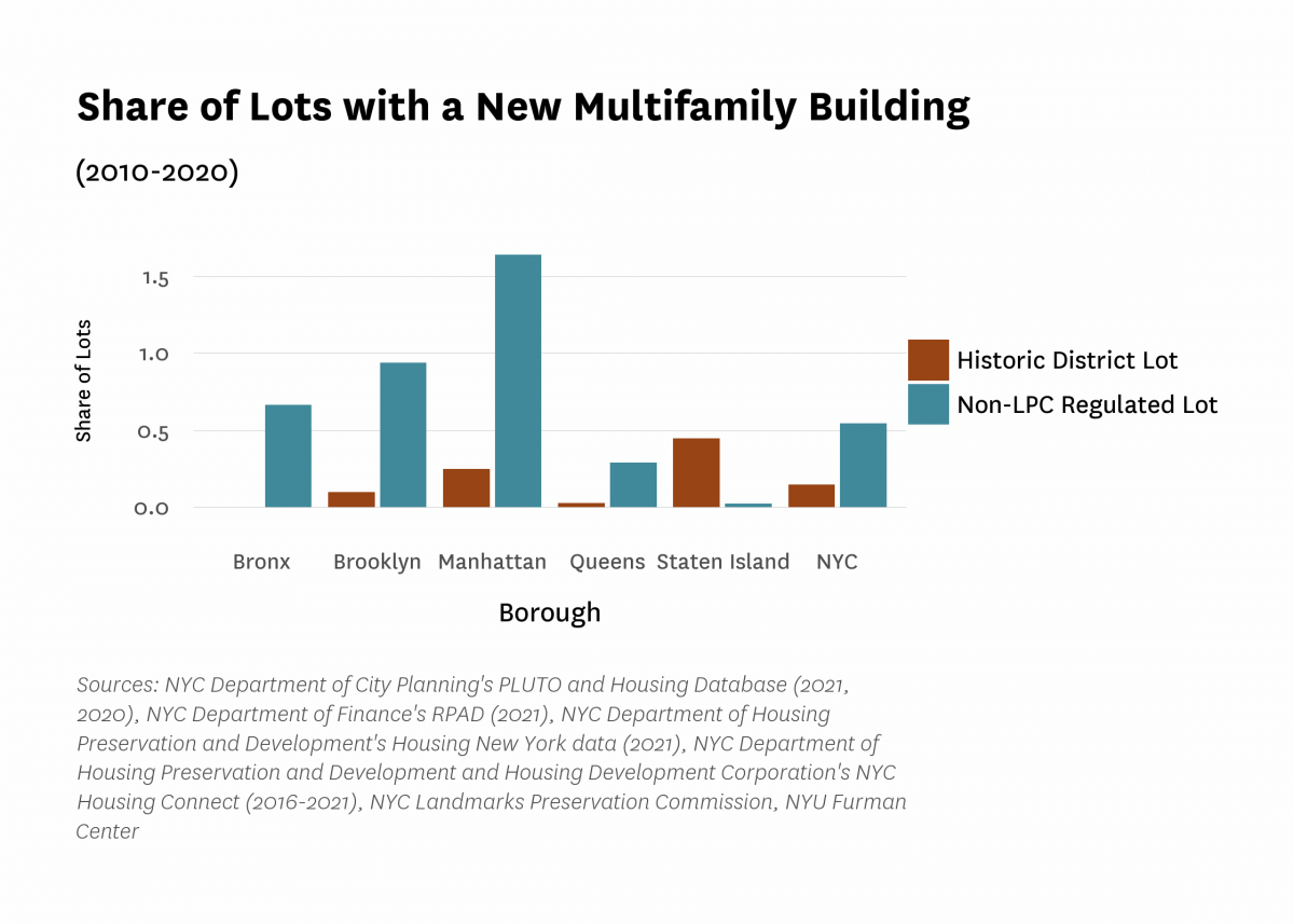
The Landmark Preservation Commission designates historic districts in New York City in order to preserve the historic character of neighborhoods, promote tourism, and stabilize property values, among other goals. 8 While historic districts can be found throughout the five boroughs, they are mostly located in Manhattan and northern Brooklyn. Historic districts do not explicitly proscribe new construction, but they add significant regulatory barriers, and over the last decade tax lots in those areas were much less likely to see new multifamily development compared to the rest of the city (Figure 12). In total, 0.54 percent of all tax lots in New York City outside of historic districts were developed as multifamily buildings in the last decade, compared to only 0.15 percent of tax lots inside of historic districts. While Staten Island saw the highest share of historic lots with a new multifamily building (0.45%), that was driven by a single development, as there are only 224 lots in historic districts in the borough. The dramatic difference in levels of development between historic districts and the rest of the city suggests that designation is a significant impediment to the construction of new multifamily properties.
Figure 12:
We track new units completed in areas and on lots residentially upzoned 9 during the Bloomberg and de Blasio administrations. We track both units in City-led rezoning areas that were upzoned as well as privately-initiated rezonings. While the Bloomberg administration lasted from 2002 to 2013, we restrict our analysis to begin in 2004 due to a lack of detailed data for earlier years. 10 We limit the de Blasio era rezonings in our analysis to the first five years of the administration (2014-2018) because we assume that the development of any new development triggered by the rezonings would take at least two years for permitting and completion.
Figure 13 shows the land upzoned during the last 10 years of the Bloomberg Administration and the first five years of the de Blasio Administration. The Bloomberg era rezonings included Hudson Yards, DUMBO, Downtown Brooklyn, and Greenpoint-Williamsburg. The beginning years of the de Blasio administration include the East Harlem Neighborhood Rezoning, the Jerome Avenue Rezoning, and the East New York Community Plan.
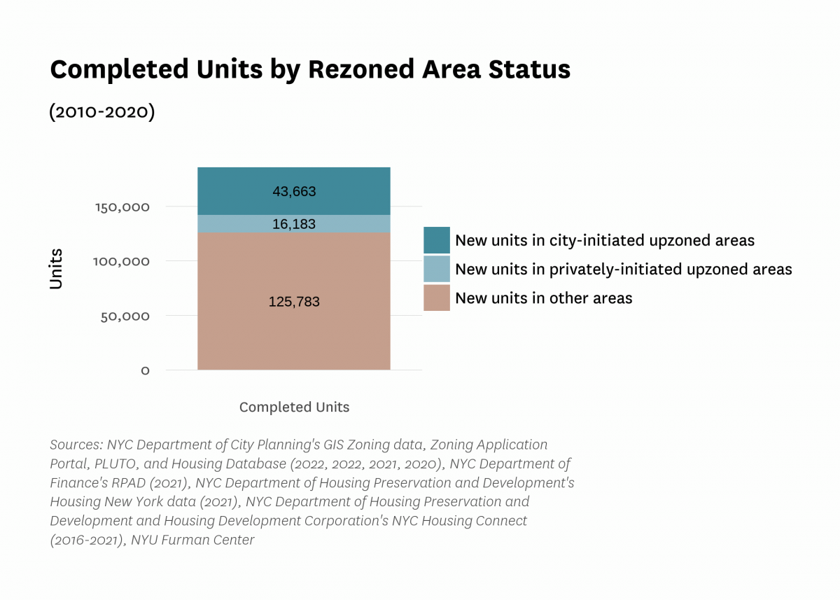
Close to a third of all new units built in multifamily properties between 2010 and 2020 were located in neighborhoods or on lots upzoned during the Bloomberg or the de Blasio administrations. The upzonings were responsible for an outsized level of new development; as a point of comparison, the upzoned areas and lots covered slightly more than three percent of all the lots in the city. The figure shows the important role upzonings play in providing opportunities for new housing development.
Units in areas that were upzoned by the City (where City agencies led the rezoning process) constituted close to 25 percent of all new multifamily units between 2010 and 2020 (Figure 14). Privately-initiated upzonings–that is, where a private entity applied for the rezoning–accounted for close to another 10 percent of new multifamily units. In contrast, areas that were upzoned by the city covered only 3.3 percent of lots, and areas upzoned by private entities covered only 0.15 percent of lots in the city.
Most of the new units built in upzoned areas were located in Bloomberg era rezonings; not surprising given their larger scope and longevity. It is worth noting that areas and lots upzoned during the de Blasio administration likely saw more development after 2020 and will see more in the future, given how recently those rezonings took place. Figure 14 demonstrates the central role that city-initiated upzonings and their privately-initiated counterparts play in helping to drive new development.
Figure 13:
Figure 14:
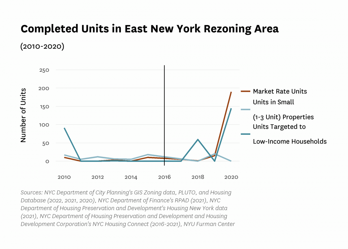
The East New York Neighborhood Plan and rezoning, approved by City Council in April 2016, aimed to foster economic development and “support the long-term growth and sustainability of East New York, Cypress Hills and Ocean Hill" 11 in Brooklyn, among other goals. The plan represents one of the major upzoning efforts of the de Blasio administration, covering portions of major corridors like Atlantic Avenue and Fulton Street and accompanied by a projection of close to 6,500 units completed by 2030 (Figure 15). 12 The rezoning was also notable for establishing the first Mandatory Inclusionary Housing (MIH) Area in the city. 13
Multifamily development in the rezoned area started the decade with over 100 units completed in 2010 (driven largely by units targeted to low-income households), before dipping in 2011 and remaining low through 2017. Two years after the rezoning, in 2018, annual development rose above 50 units before dropping slightly again in 2017 and then rising to close to 350 units in 2020, the highest annual level in the period. The four-year lag before the dramatic increase in new development is consistent with the typical permitting and construction timeline. 14 Notably, we do not see a similar increase in the completions of units in small buildings (1-3 unit buildings) after the rezoning; the rezoning did not change developers' ease of constructing such small buildings (Figure 16).
Of the multifamily units built in 2020, more than 40 percent were income restricted and targeted to low-income households. It remains very early to assess new development in this neighborhood, and these data only capture the beginning of new development stimulated by the rezoning.
Figure 15:
Figure 16:
To consider how new development relates to the risk of flooding, we map the current effective FEMA Flood Insurance Rate Map (FIRM) for New York City, which was created in 2007 and determines which households are required to purchase flood insurance based on a 1 percent annual risk of flooding (also called a 100-year flood zone) (Figure 17). 15 Because the 2007 FEMA map is somewhat outdated in terms of current flood risk, we also map the 2020s 100-year floodplain, which is based on FEMA’s Preliminary Work Map data and projections by the New York Panel on Climate Change (NYPCC), and represents a more up-to-date estimate of current flood risk. 16 All coastal areas of the city are within the NYPCC 2020s 100-year floodplain, with southern Brooklyn and Queens as well as Staten Island having especially large swaths of vulnerable land area.
In total, only 3.3 percent of the city’s residential units are in the FEMA 100-year flood zone. A notably higher share of newly-constructed units (both market rate and those targeted to low-income households) were built in the FEMA flood zone (Table 7). Similarly, compared to existing units, a higher share of the city's new development was also constructed in the NYPCC 100-year floodplain, with 13.6 percent of all new units targeted to low-income households and an even greater share (18.2%) of newly constructed, market-rate units located in the floodplain.
Figure 17:
Table 7:
| Development by Floodplain Status | ||
|---|---|---|
| In 2007 FEMA FIRM | In 2020 100-Year Floodplain | |
| Share of new market rate units | 7.9% | 18.2% |
| Share of all new low-income units | 7.3% | 13.6% |
| Share of all NYC residential units | 3.3% | 8.6% |
| Sources: NYC Department of City Planning's Flood Hazard Mapper, PLUTO and Housing Database (2017, 2021, 2020), NYC Department of Finance's RPAD (2021), NYC Department of Housing Preservation and Development's Housing New York data (2021), NYC Department of Housing Preservation and Development and Housing Development Corporation's NYC Housing Connect (2016-2021), NYU Furman Center | ||
New development inevitably seems to invite controversy and debate, even in dense cities like New York. Some observers think the city’s housing market is building too much housing in general, or at least too much “luxury” housing, while others charge that production is falling short of demand, and thereby deepening the affordability crisis. There are also debates about the incomes targeted by subsidy programs, with some arguing that allowing developers to provide housing for moderate- and middle-income, rather than low-income, households is not the best use of government resources. People also disagree about whether more income-restricted homes should be built in wealthier, whiter, and better-resourced neighborhoods, and whether market rate housing in lower-income, often predominantly Black or Hispanic, neighborhoods helps or hurts those communities. Similarly, there is debate over whether certain neighborhoods are bearing a disproportionate burden of new development while others are seeing little or no new construction. Finally, there is a robust discussion about whether new homes should be built in areas that are most at risk of experiencing flooding.
Our analysis adds some empirical facts into these debates. We show that about two-thirds of new multifamily units built in New York City over the last decade were market rate. While new market rate units were concentrated in lower Manhattan and central areas of Brooklyn and Queens, Government Subsidized units targeted to low-income households were more commonly located in the South Bronx. Units in properties using only the 421-a tax exemption (and no additional subsidies) generally followed the same patterns as market-rate units, likely because they were often located in the same, mixed-income properties.
At the neighborhood (SBA) level, new government subsidized units targeted to low-income households were built in areas with higher Black and Hispanic population shares, higher poverty rates, and lower prices and rents than those of new units overall. In addition, new units targeted to low-income households that are suitable for families (with two or more bedrooms) were located in higher poverty census tracts than smaller units. These patterns raise concerns about whether the location of new income-restricted units is doing enough to counter patterns of economic segregation and to connect low-income children, in particular, to well-resourced neighborhoods.
Historic district lots saw lower levels of new multifamily development overall, compared to other lots in their same boroughs. We also found that more than a third of the new development was in recently upzoned areas, which illuminates how loosening density limits can allow for more new housing to be built. Finally, many newly-built units were located in coastal areas at high risk of flooding, which raises questions about how development in those climate-sensitive areas should be regulated.
This analysis draws on a number of data sets, as well as our own estimation of income-restricted units. Below, we outline our sources and methodology in detail and consider the limitations of our approach.
In this report, we rely on data from the Department of Buildings (DOB) to trace all residential units in properties with four or more units that received their first Certificate of Occupancy between 2010 and 2020 and to identify the year the property was completed. We match those properties to property-level data from the New York City Department of Finance (DOF), the Department of Housing Preservation and Development (HPD), and the New York City Department of City Planning (DCP) to identify building characteristics like property size and location. For properties where unit counts are missing or inconsistent across data sources, we first prioritize unit counts from DOF, and then backfill counts from HPD’s Housing New York data and DOB.
We match our set of properties to DOF tax exemption data from the final roll of tax year 2021-2022 to identify active 421-a, 420-c, and Article 11 exemptions. We draw on data from the New York State Department of Housing and Community Renewal (DHCR) and the U.S. Department of Housing and Urban Development (HUD) as well as HPD’s Local Law 44 data to identify properties with LIHTC contracts.
For the purposes of estimating income-restricted units, we use HPD’s inclusionary Housing Sites map to identify units with on-site Voluntary Inclusionary Housing (VIH); unfortunately, we are unable to link generating VIH sites to secondary receiving VIH properties. We do not examine MIH income-restricted units in these properties, as they may overlap with units required under various programs at the property level. We also overlay the Municipal Art Society of New York’s shapefiles for the 421-a Geographic Exclusion Areas to determine whether properties fell within them.
When we estimate the number of new units in multifamily properties per 1,000 residents, we use population data from the 2010 Decennial Census.
We use data from a variety of sources to count the number of income-restricted units targeted to households earning less than or equal to 80% of AMI and units targeted to households earning between 81% and 165% of AMI (Table 1). We use granular data dating collected from HPD’s Housing Connect platform and Housing New York data, detailed exemption information from DOF, and data on LIHTC from HUD and HPD. The Housing New York data is limited in that it only covers properties built after 2013, while the Housing Connect data covers 421-a properties built after 2015.
Due to restricted availability of granular data, our calculations of income-restricted units should be read as conservative estimates. Because Housing New York and Housing Connect data are limited to after 2013, we are unable to capture all income-restricted units targeted to moderate-income households completed earlier in the decade and our calculations can be considered a lower-bound estimate. Similarly, our counts of units targeted to low-income households will be lower bound estimates prior to the availability of HPD’s data. We employ conservative estimates that 20 percent of units in 20-year 421-a properties and some 25-year 421-a properties (see table below) are income-restricted and targeted towards low-income households, but those counts may be higher in some cases.
We draw on a number of publicly-available geospatial data to identify the location of units according to regulatory- and climate-based geographies. For our analysis of new development according to the zoning district, we draw on property-level DOF data and then map the residential zones using data from DCP. We overlay the map of historic districts from the Landmarks Preservation Commission and DCP to determine which new properties were built inside of those districts. Finally, for our flood zone analysis we use the 2007 FEMA FIRM map accessed via DCP’s Flood Hazard Mapper and the 2010 100-year floodplain map provided by the Mayor's Office of Long-Term Planning and Sustainability (OLTPS) on behalf of CUNY Institute for Sustainable Cities (CISC) and the New York Panel on Climate Change (NPCC).
For our analysis of rezonings under Mayor Bloomberg and Mayor de Blasio, we use DCP files on Zoning Map Amendments, limiting our analysis to adopted map amendments effective during the Bloomberg administration between 2004 and 2013 and the first five years of the de Blasio administration. We define “upzonings'' as rezonings that resulted in an aggregate increase in the Floor Area Ratio (FAR) of the area’s lots of at least 20 percent between either the year prior to and after the zoning map change, or the two years prior to and after the change. While the Bloomberg administration began in 2002, we only have access to detailed data on FARS beginning that year, and so we begin our upzoning analysis two years afterward in 2004. Finally, we identify City- and private-initiated upzonings using applicant data from the NYC Planning Zoning Application Portal, defining any applications listing a City agency as an applicant as City-initiated and the remaining upzonings as private-initiated.
All content © 2005 – 2024 Furman Center for Real Estate and Urban Policy | Top of page | Contact Us